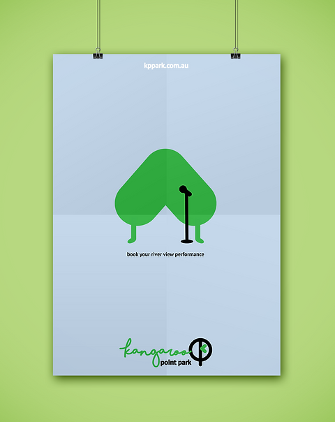
RE-BRAND KANGAROO POINT CLIFF
More than creating a nice logo
 |
|---|

BRIEF
Environmental design
Produce a comprehensive visual identity system across a range of mediums using design principles, concepts and techniques. Construct a coherent visual solutions through diverse communication skills to respond to complex problems.
THE DESIGN PROCESS
Images can be enlarge
RESEARCH
Kangaroo Point Cliff park was designed by Nicole Voevodin - Cash in 2010, who describes her work as "akin to being in a room, because they bring people together to play, interact and relax."
Although the area is spacious, provides barbecue facilities with a stunning river view, it remains underused. Shade being one of the problems, on top of that riding is prohibited in the park and it is not ideal for ball games due to the scraggly lawn, therefore it can’t be catagorised as playground for kids and families.
Having said that, the area still has a lot of potential and the challenge is to re-brand it and show people there are so much more to Kangaroo Point Cliff Park.
*double click to enlarge
 |  |  |  |
|---|---|---|---|
 |  |  |  |
 |
LOGO DEVELOPMENT
From a combination of pointy letter K P P to a combination of K P P incorporated main character "Pointman".

BRAND ANATOMY
 |  |  |
|---|---|---|
 |
BRAND EXPRESSION BOOK
swipe ⟷


POSTER AND MERCHANDISE


SUPPORTING CHARACTERS
The cool beans


